GILENYA was a transformational advance as the first oral treatment for people with relapsing multiple sclerosis. With no more painful injections to take on a regular basis, patients could forget about their disease while its efficacy got them back to leading active lives. Novartis launched GILENYA in 2010, and was followed by Sanofi’s AUBAGIO and Biogen Idec’s TECFIDERA.
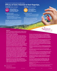
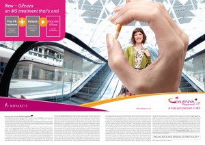
As a game changing oral therapy, it was logical that the GILENYA launch campaign focus on the convenience of the pill, as well as the benefits of its efficacy. The global HCP communication depicted an active patient viewed through a visually prominent opening between two fingers holding the pill. It was a new perspective on MS therapy.
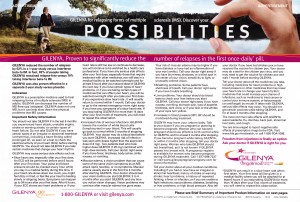
Physicians around the world recognized that this icon conveyed efficacy and tolerability delivered by an oral treatment. The DTC campaign continued the strong branding with its “Possibilities” ad. Here we see the same hand from the HCP campaign holding the pill as the letter “I” in the headline, with the patient in the background. GILENYA makes a strong case study of true global branding, spanning multiple cultures and audiences.
One of the basic ground rules of concepting is to analyze the creative competitive landscape – what visuals and icons are your competitors owning and what branding and messaging are physicians exposed to. This way you can avoid branding repetition and confusion and ensure that your brand is positioned uniquely.
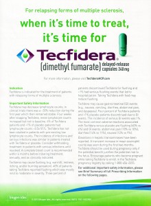
So then in 2013 along comes TECFIDERA, third oral to the MS market. The HCP launch campaign was your basic announcement ad with branded colors and capsule shot. A year later, a DTC ad appeared touting TECFIDERA as the number one prescribed pill for relapsing MS with…wait for it…two giant fingers holding a green capsule simulating a bridge as a patient walks across it over a stream! 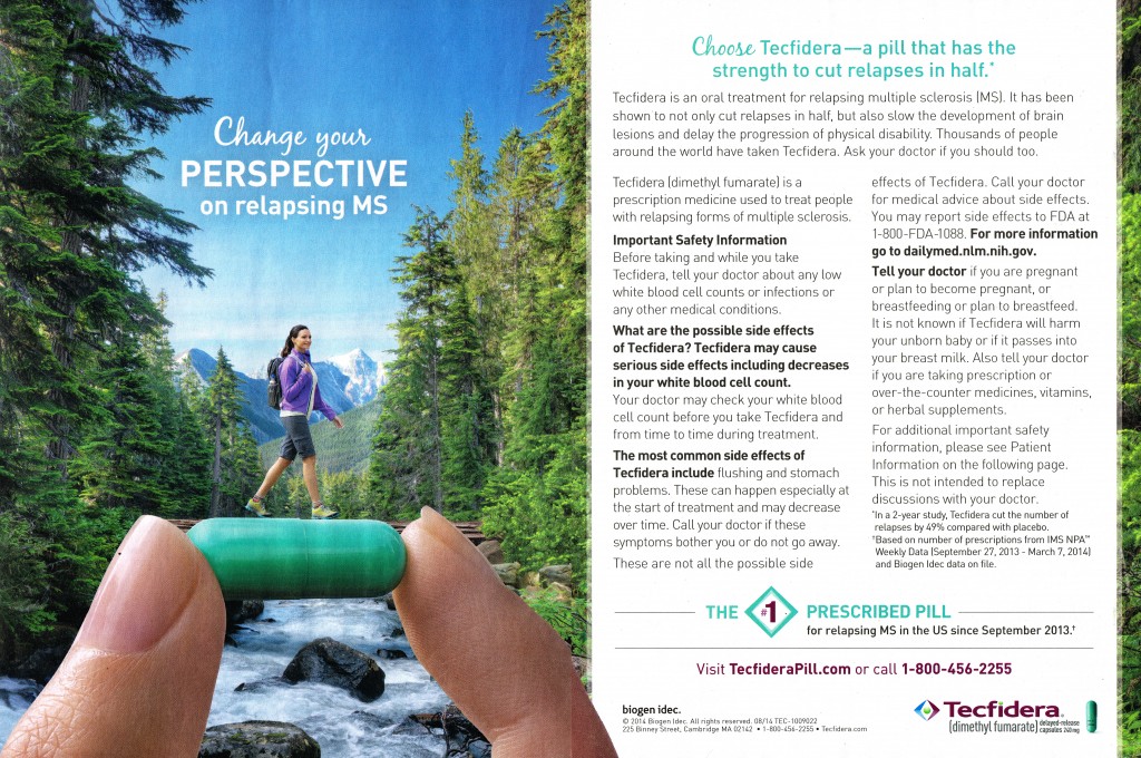 At a quick glance, this could be another GILENYA ad. Was this intentional? Did the agency not do their homework? Did Biogen Idec not care? Yes, it’s been three years since the iconic GILENYA launch, but has that time wiped the branding from the audience’s minds? And even if it has, this concept still feels like borrowed goods. On principal alone, why would you use a direct competitor’s visual icon? Remember, if it feels like it’s been done before, it probably was. If I was Novartis, I’d be calling the concept cops because they were robbed! I’m giving this TECFIDERA ad the finger – a thumbs down for unoriginality.
Leave a Reply