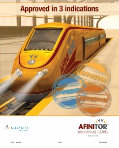
The creative team is gathered at the Round Table. Before them is their quest, two words written on a brief: POWERFUL PROTECTION. Where for art thou, Sir Metaphor??
What’s not to like about Knights? They fought bravely, wore cool protective armor, held shields branded with their own personal logos, they jousted and lived by a moral code of chivalry. Knights are the epitome of “powerful protection”. There are many drugs on the market that also offer powerful protection. “Hey, let’s use an ancient medieval icon to represent our modern therapy”, said too many agency creatives (and probably a few brand managers).
 How will this icon represent the brand? Will it make an emotional connection with physicians and be imprinted in their minds and hearts or will it quickly say “powerful protection” for a fleeting moment until a journal page is turned or an iPad screen swiped?
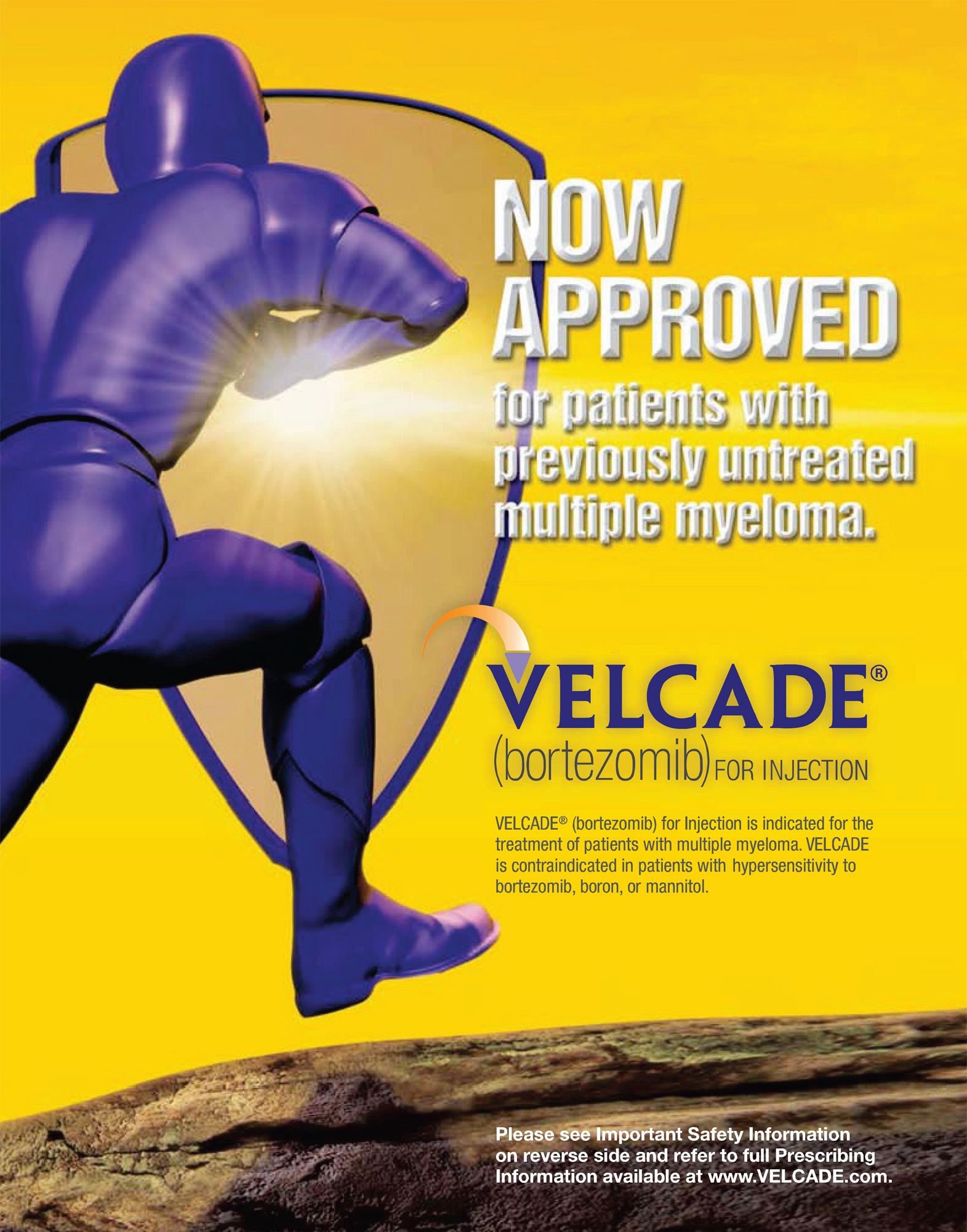
VELCADE (multiple myeloma) has its purple knight poised for battle with rays of hope beaming through a rather large transparent shield. If you look closer, it may not be a knight at all, but rather a member of the riot police about to beat down an insurgent crowd. Regardless, a physician will only spend 1-3 seconds taking it all in, so for practical reasons, let’s say it’s the Purple Knight.
There is promise on the horizon (note the rising sun) with DEXILANT (GERD). This knight, glistening in highly polished armored, proudly displays an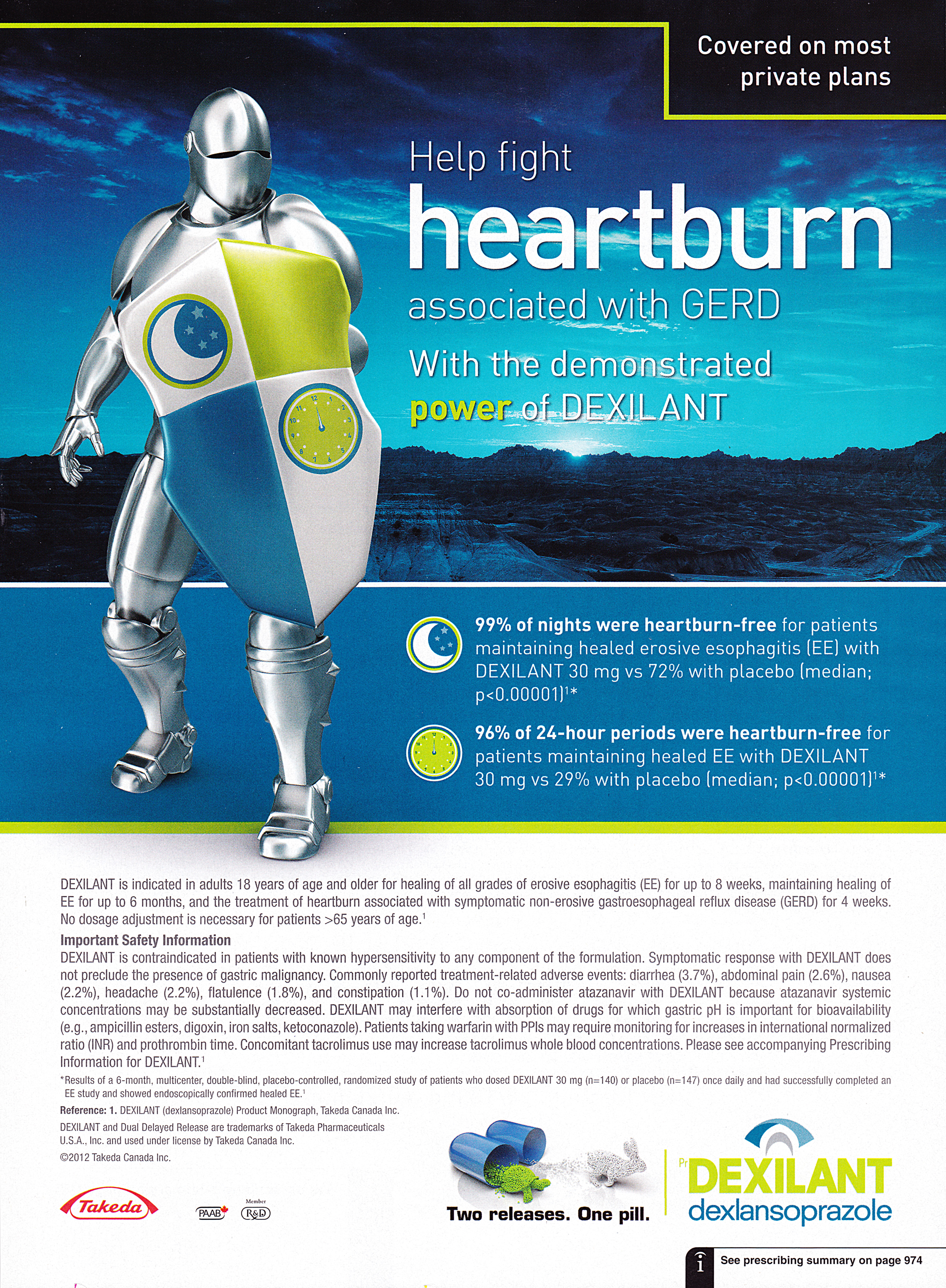 infographic shield. Take heed, your strongest icons are singular in focus. Here, the DEXILANT knight is attempting multiple messages, “power, day and night.” Just to make sure the reader gets it, “power” is highlighted in bold lime green in the headline. And in case you don’t associate knights with heartburn, the indication is presented in 700pt type. My only question is, “Where is the fire-breathing GERD dragon?”
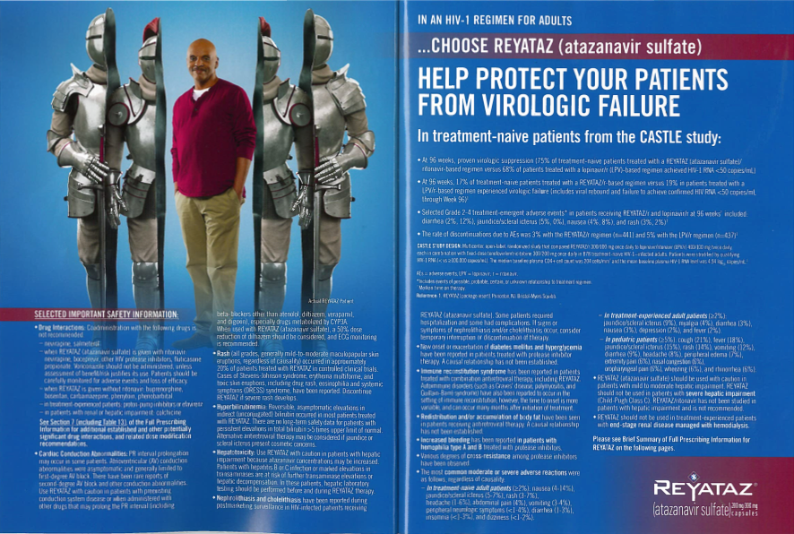
REYATAZ (HIV) gives you double protection with two layers of knighthood, but only if you’re wearing a branded sweater.
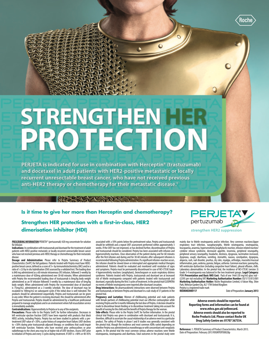 Every knight knows that you are vulnerable if you leave the castle wearing only your “chain mail” (the layer of tiny metal ring linked together in a mesh pattern). Right before your eyes, PERJETA (breast cancer) transforms gold mesh into gold-plated armor for gold standard protection!
If you have a gun (or a sword) to your head and have to use a metaphor, a rule of thumb is do something to it to make it unique, so that it stands apart from its clichéd predecessors. Does it make the concept any less pharma-cheesical? No, but at least it won’t be a carbon copy of another brand’s used icon, which is what INCIVEK (Hep C) did with their knight.
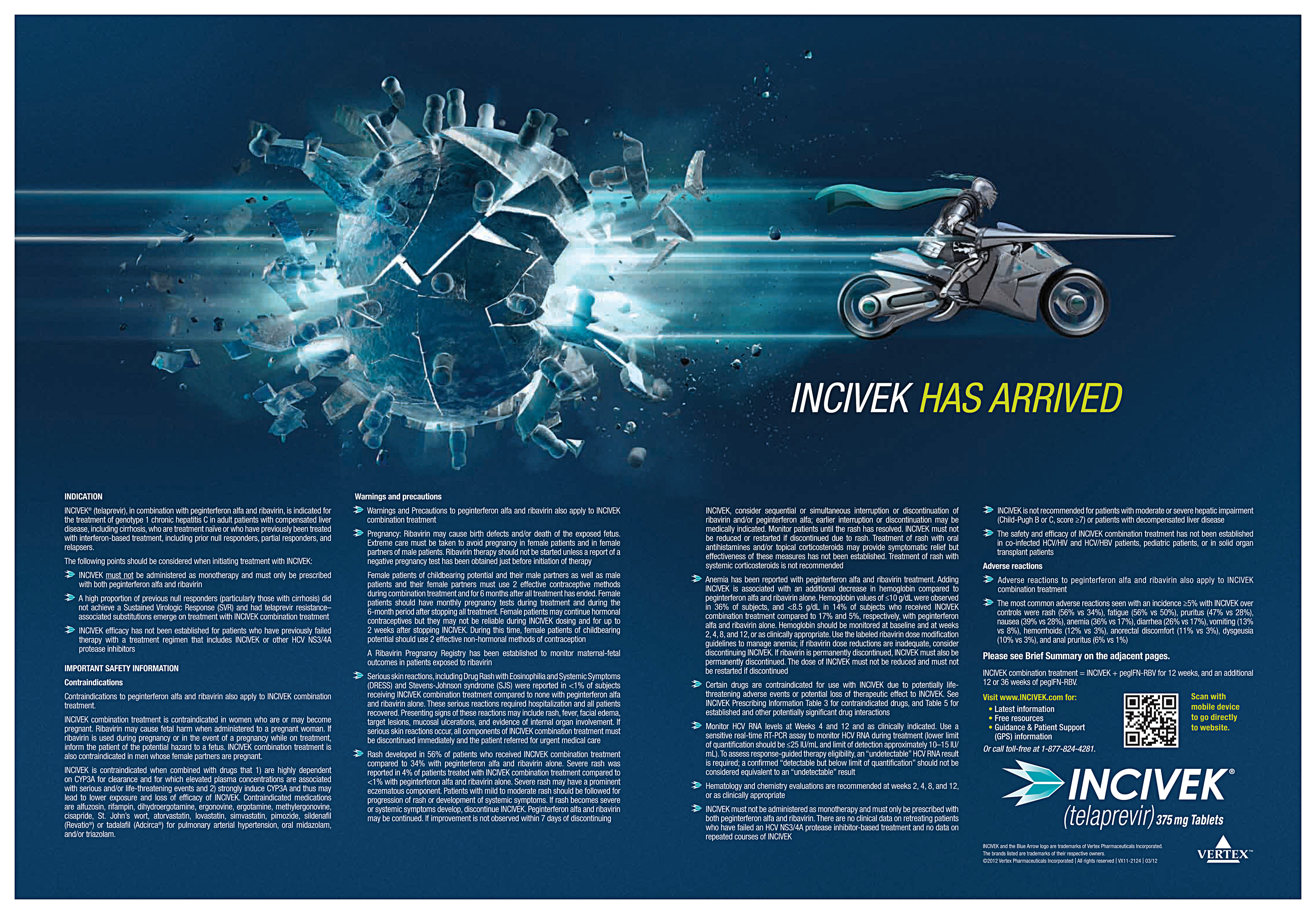 INCIVEK supersized their jousting knight with “SPEED, POWER and PRECISION” by putting him on a high-tech motorcycle, lance in hand and branded cape flying, having just pierced and destroyed a Hepatitis C cell. Is it memorable compared to other knight icons? Yes. Is it still a cliché? Yes.
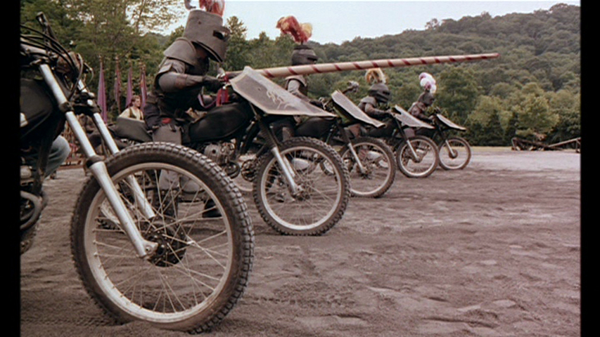
The motorcycle jousting scene
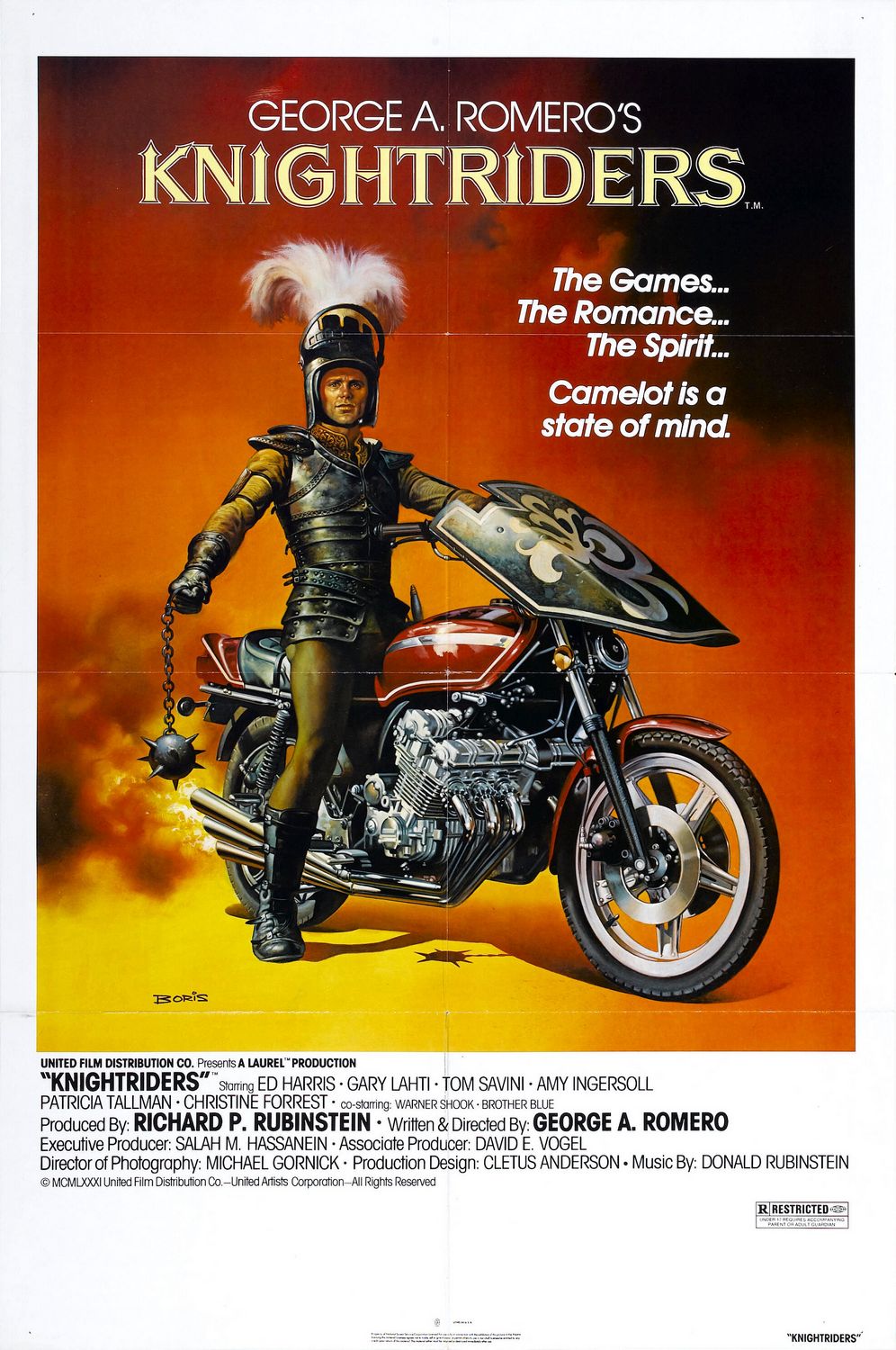 While I’m still not a fan of this concept, there is a special place in my heart for this particular icon because it makes an emotional connection with me. Why? It takes me back to 1981, to a movie from my youth that I fell in love with but haven’t seen in decades. If you like Arthurian legends, then you must check out Knightriders, directed by George Romero and starring a young Ed Harris as the leader of a group of traveling knights who compete in jousts on motorcycles at Renaissance Fairs. It was a current take on Camelot, although 1981 is already feeling like the Middle Ages. I’ve always wondered if the creative team was “inspired” by this movie, with its knights on bikes, and if I was the only one this icon made a human connection with? Want to use metaphors? “We are the Knights who say NO!” (Monty Python & The Holy Grail reference).


Recent Comments