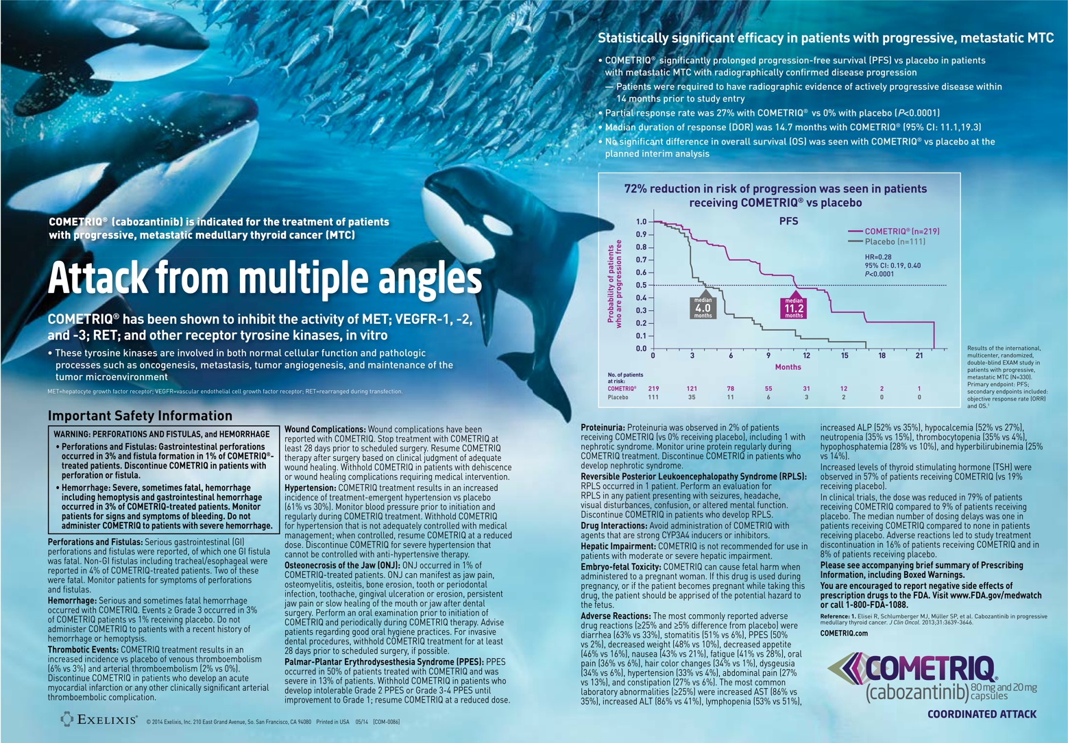
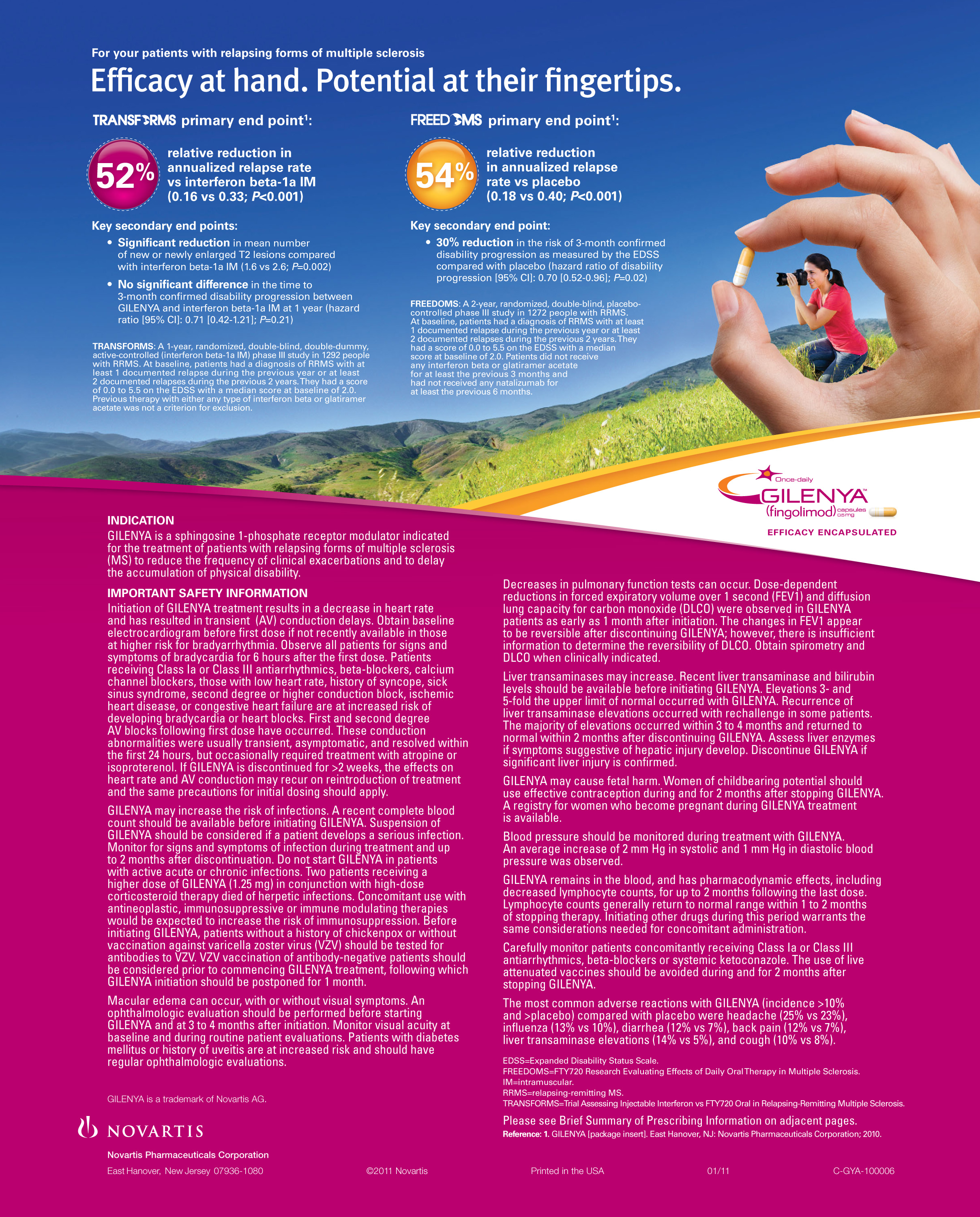
 COMETRIQ is indicated for the treatment of patients with progressive, metastatic medullary thyroid cancer. Prognosis is poor when the cancer has metastasized beyond the thyroid gland. In clinical studies, COMETRIQ helped to delay the growth of MTC tumors in some people and shrink MTC tumors in others.
The creative teams were tasked to bring COMETRIQ’s unique triple action MOA to life. Somewhere between the first internal creative review, several rounds of client presentations and multi-city qualitative one-on-ones, the creative process got beached.

Would you trust Jacques Cousteau with your thyroid cancer?
The first person I think of to treat thyroid cancer is a marine biologist. Why else would I see three killer whales attacking a school of fish in this communication to endocrinologists and oncologists? Killer Whales? Cancer? How is it relevant? If Jacques Cousteau were alive, he would explain to us that killer whales are sometimes called the wolves of the sea, because they hunt in groups like wolf packs. Large school of herring are often caught using carousel feeding – the killer whales force the herring into a tight ball by releasing bursts of bubbles and then slap the ball with their tail flukes killing up to a dozen fish at a time. “Wow, much like the way COMETRIQ inhibits the activity of MET; VEGFR-1, -2, and -3; RET; and other receptor tyrosine kinases, in vitro!” said no one ever, except maybe the client’s medical director and brand manager.
While there hasn’t been another “killer whale” ad in pharma (at least none in captivity), why jump to borrowed interest? Did the creative director approve this or was the metaphor thrust upon the agency by the client? In today’s “legally driven, risk-adverse, keep the client happy so we keep the business, dumb it down for doctors because they don’t want to think when they see an ad” environment, it is very tempting to succumb to the mediocre metaphor. As creatives and as agencies, we must persevere to create provocative and engaging communication and educate clients to its benefits.
Now, if you have to use a borrowed interest cliché or metaphor, push it – put a little spin and surprise on it. In 2005, TITRACE ran a “Whale” ad of its own so engaging it would warm even Captain Ahab’s heart.
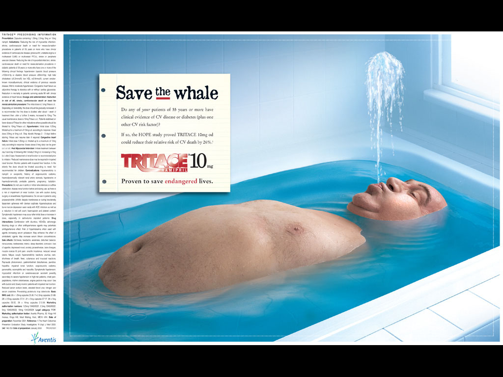 TITRACE was an ACE inhibitor that also reduced the risk of MI, stroke or CV death in vulnerable patients. The main message the creative team had to deliver was: TITRACE saves lives. Rather than depict patients in a somber tone to reflect the seriousness of the disease, the agency used humor to create more impact. Under a call to action headline, “Save the Whale”, was an image of an overweight patient in the bathtub spouting water from his mouth. “Save the Whale” was the first in a campaign of overweight patients as endangered species, followed by Save the Panda, Penguin, Walrus and Tiger. Jon Watson, the TITRACE Creative Director at Lowe Azure UK put it simply, “A big message, softly spoken, often has more impact than one rammed down the reader’s throat.”
It was brilliant, but not without risk…risk of offending doctors and overweight patients, and risk of pissing off Aventis. The client felt it was worth taking a chance and market research confirmed that it was very relevant to physicians. As a result, the campaign had an 80% spontaneous recall with docs and the brand exceeded sales.

Save the Panda
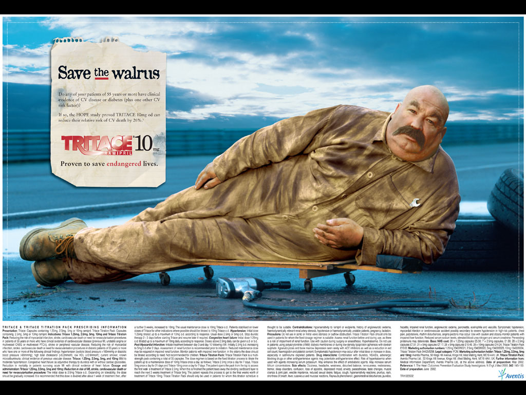
Save the Walrus
Unfortunately if the TITRACE campaign were presented today, 10 years later, it probably would never make it past the client. In the lawsuit-happy world we live in, where the easily offended use social media as a pulpit, it is doubtful that there is a brand manager willing to take the risk of calling their patient a whale and then seeing the outrage trending on Twitter the next day (Calling them pandas? Maybe. Everyone likes cuddly pandas). And remember, the Med Legal Gods don’t like definitive words like “Save” and “Proven”. The headline would be modified to read, “May Save the Whale” or “Assist the Cetacean-like Patient” and the tagline, “Proven to save endangered lives” would become too long to be considered a tag.
 Yes children, today’s creative teams wear med legal handcuffs, but that’s no excuse not to strive for brilliance and at least try turning a metaphor on its head to engage your audience. Don’t let your creativity become an endangered species!
Recent Comments