“Let the pigeons loose!” I think of that phrase every time I see a pharma ad using birds as a visual. Children of the 70’s might remember the demolition derby episode of Happy Days with the Fonz and Pinky Tuscadaro versus the Mallachi Bros…it was Count Mallachi’s signature line. He said it over and over and over again across a two-part episode. Birds also appear in pharma advertising over and over again, “Let overused metaphors loose!”
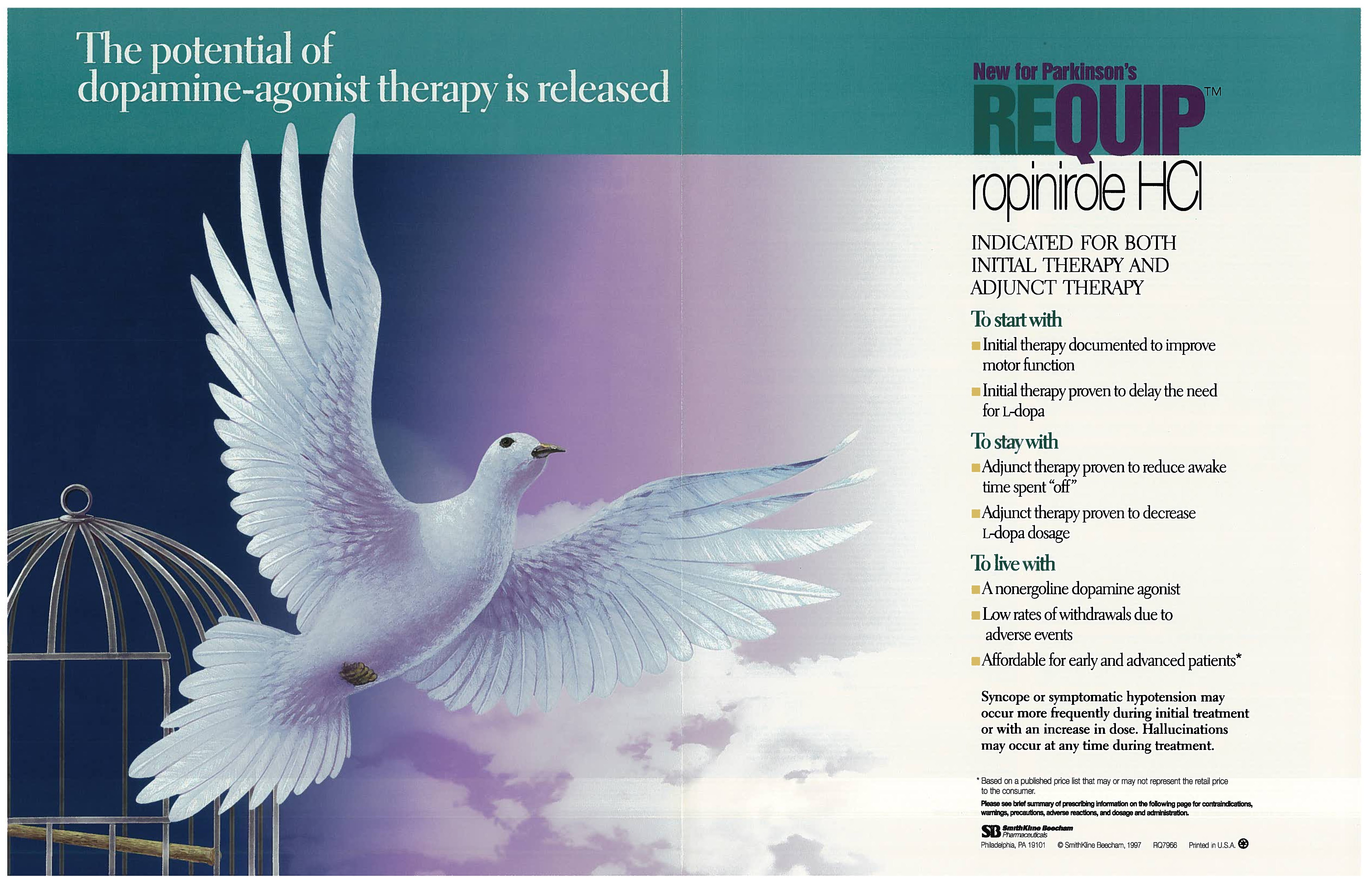
 Back in the day when GSK was SB (SmithKline Beecham), they launched REQUIP for Parkinson’s disease using a white dove released from its cage. The dove, flying upward at full wingspan, signified hope from the constraints of Parkinson’s.
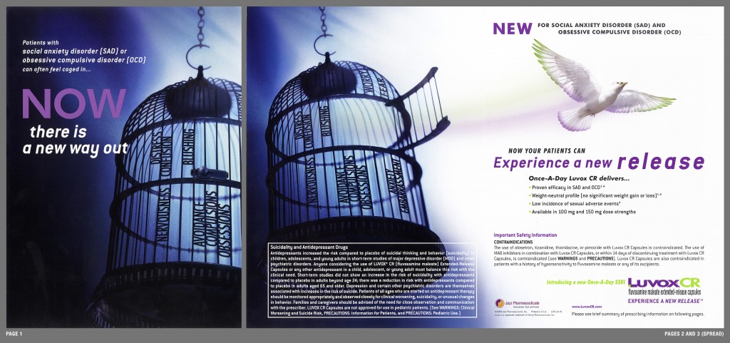 If there was a pharma creative statute of limitations, Jazz Pharmaceuticals was probably safe from getting a phone call from SB or GSK. About ten years later in 2008, LUVOX for social anxiety disorder (SAD) and obsessive compulsive disorder (OCD), launched the brand using a white dove being released from its cage. Same white dove, same perspective, same full wingspan, same coloring and same background, going from dark blue to purple to white. The only difference was that the image was pulled back to put emphasis on the birdcage with the effects of the disorders spelled out on the bars of the cage. We’re told that “Patients can often feel caged in” and now they can “Experience a new release.” I feel bad for the parakeets at my local pet shop.
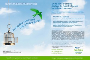 The “freeing the caged bird” theme continued with the DTC ad for AMITIZA, indicated for chronic idiopathic constipation in 2007. This time a green sparrow is freed from its gold prison to the exclamation of “Predictable relief may help you break free.” I’d love to see the insight research that showed patients connote having a bowel movement with birds escaping jail.
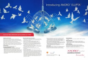 Birdcages appeared again in a Canadian HCP ad for ANORO ELLIPTA, a bronchodilator for COPD. The twist here is that two cages hang from one chain simulating human lungs. Both doors are open freeing dozens of white birds with the tagline: “Breathe”. While it’s still another birdcage metaphor, at least it’s more apropos to COPD than to constipation.
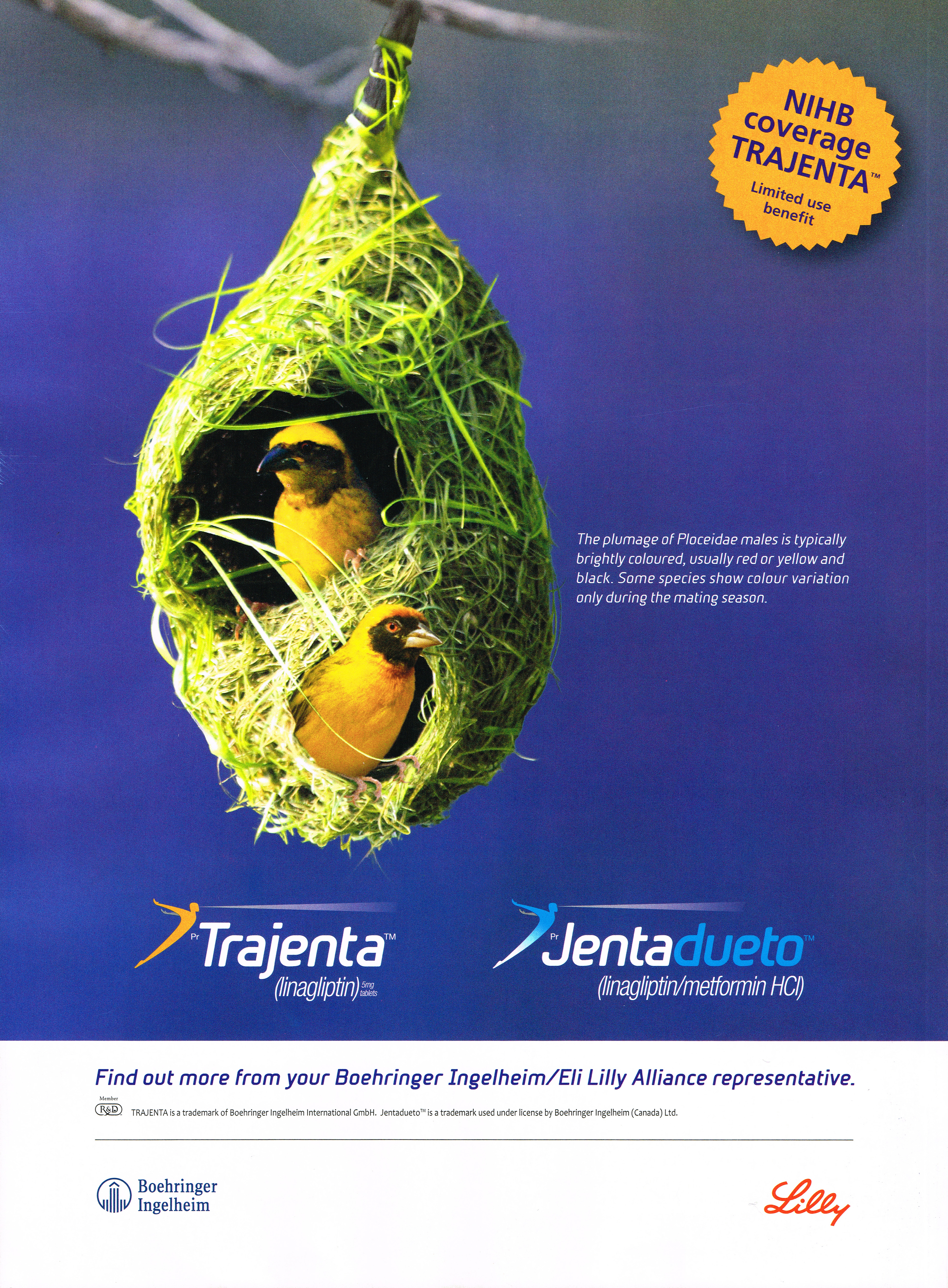
While we’ve hopefully seen the last of birdcages, a Hitchcockian cloud seems to still hang over our industry. One of mankind’s greatest mysteries (or at least to the several thousand people in the healthcare & healthcare advertising industries since 2012) is Lilly & BI’s TRADJENTA campaign, indicated for glycemic control for patients with Type 2 diabetes. The launch ad shows a yellow bird building a nest with the headline “Focusing on what matters”. What matters? Building a nest? Protecting baby birds? How does building a nest connect with type 2 diabetes? What type of bird is this? Do I need to be an ornithologist to understand what’s going on? More riddles here than the Sphinx!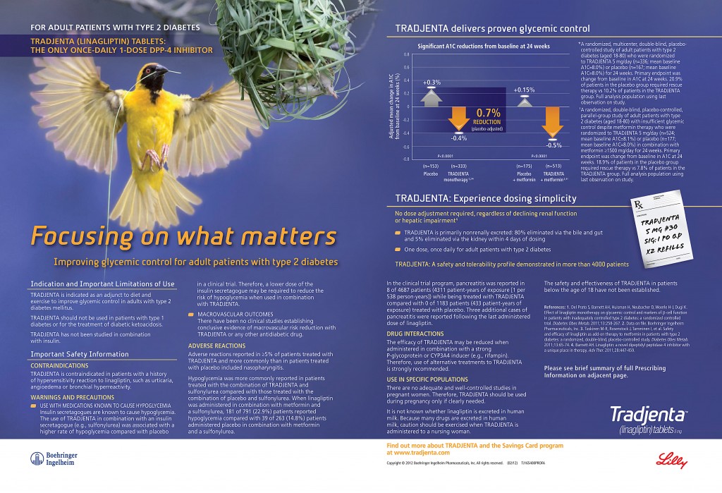
Many hours have been spent in healthcare agency kitchens and conference rooms trying to decipher this concept. How did doctors in market research, who are notorious for not wanting to think when they view ads, choose this one? THEY got it? It doesn’t make sense or does it?
 Upon deeper investigation, we learn several things. This is a global campaign and a co-promote which means there are four clients for the agency: Lilly US, BI US, Lilly global and BI global, usually a difficult recipe for creating campaign consensus; and two audiences, US and ex-US physicians each with their own cultural tastes. In addition, thought had to be given to how the branding would extend to the launch JENTADUETO (linagliptin with metformin) that would follow shortly after. Perhaps this campaign was the one of least resistance. Only the parties involved know how it went down. If we start looking at some of the global work over time, we find a clue…a blurb about the Ploceidae family of birds next to the image, which then leads us to Wikepedia. We discover that the Ploceidae are also known as weaver finches, because of their elaborately woven nests. Is that what makes TRADJENTA special, because it allows physicians to take special care and better control of the intricacy of type 2 diabetes? Is the elaborate nest a testimony to efficacy? Wow, mystery solved, Scooby-Doo! I think. So much for the three second takeaway. (We’ll save the discussion about the ex-US superhero logo icons for another time). Call me the Birdman of Linagliptin!
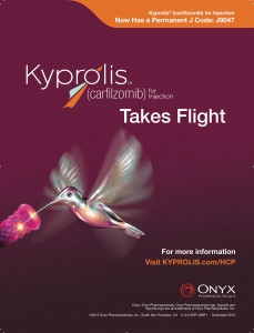 Lastly, in the “What are the chances that two brands simultaneously launch with the same icon?” category, we present KYPROLIS, a second-generation protease inhibitor from Onyx Pharmaceuticals and BETHKIS for cystic fibrosis from Chiesi Farmaceutici. While they both launched in the spring of 2014 and are each indicated for completely different diseases and audiences, they both use a hummingbird as their icon. As to why the hummingbird, please do your own Google search!
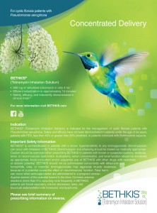
“I think we’re in real trouble. I don’t know how this started or why, but I know it’s here and we’d be crazy to ignore it… The bird war, the bird attack, plague – call it what you like. They’re amassing out there someplace and they’ll be back. You can count on it…” So if you’re compelled to use BIRDS for your next concept, just think of what happened to Tippi Hedren in the movie of the same name.
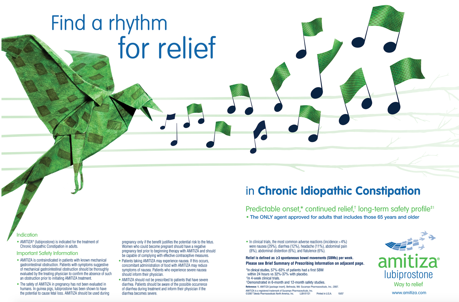
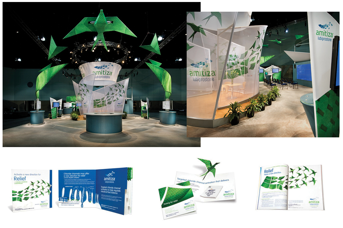 AMITIZA (lubiprostone) is a treatment for chronic idiopathic constipation. It increases fluid secretion in the intestines, which increases intestinal movement, which helps make it easier to have bowel movements. This MOA seems to be represented in their logo, a tight blockade of rectangles that start to dissipate and turn into flying birds. If there is one brand in pharma that has the rational excuse to use origami in their marketing, it would probably be AMITIZA. Those rectangles become paper transforming into origami birds, which is exactly what we find in a 2007 ad. Here, the AMITIZA bird is made of green branded paper singing branded paper musical notes. In the AMITIZA convention booth, the origami icon comes to life above its audience.
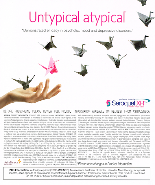 This 2012 ad for SEROQUEL (quetiapine) from Australia bears a strong resemblance to the AMITIZA birds, this time with flying origami crane. Yes five years have passed, yes it’s on a continent on the other side of the world, yes it’s in a different therapeutic category, but why would you still use an icon that is strongly tied to another global pharmaceutical brand? Maybe they should have created origami jailbirds because it’s a crime!
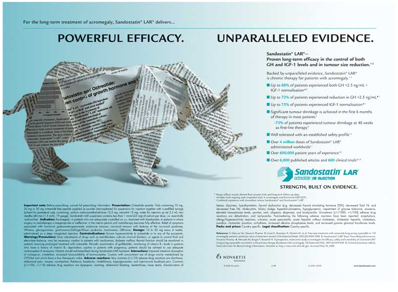 A 2010 ad for SANDOSTATIN (octreotide) and a Portuguese ad for PEGASYS (peginterferon alfa-2a) are almost identical. Both use printed clinical data to create their origami animals, a rhino for SANDOSTATIN and the iconic Pegasus for PEGASYS. The PEGASYS headline reads “Clinical studies and a lot of research transformed into life.”
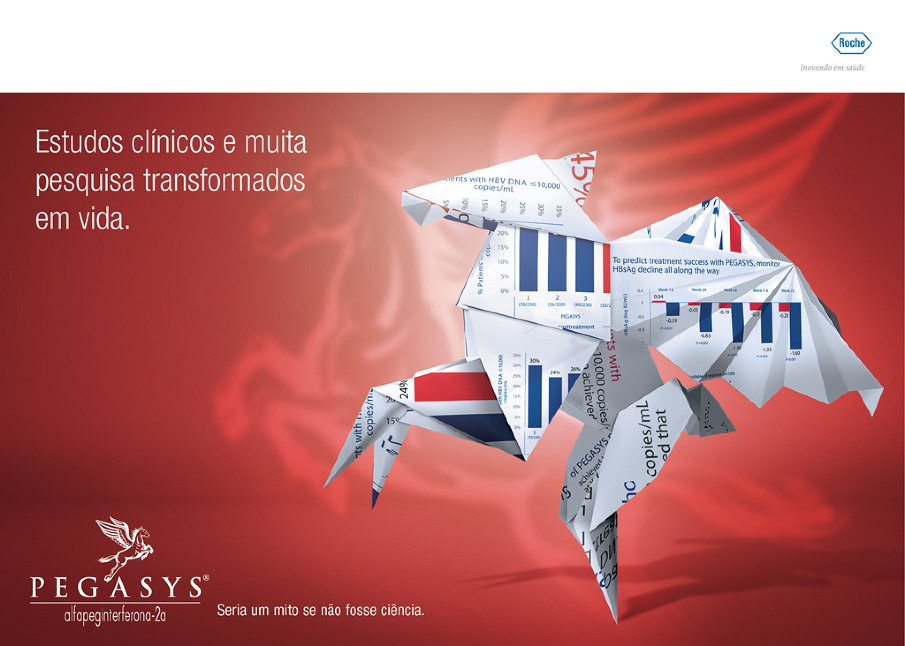 The big question is, which one would win in a fight, the rhino or the mythical Pegasus?
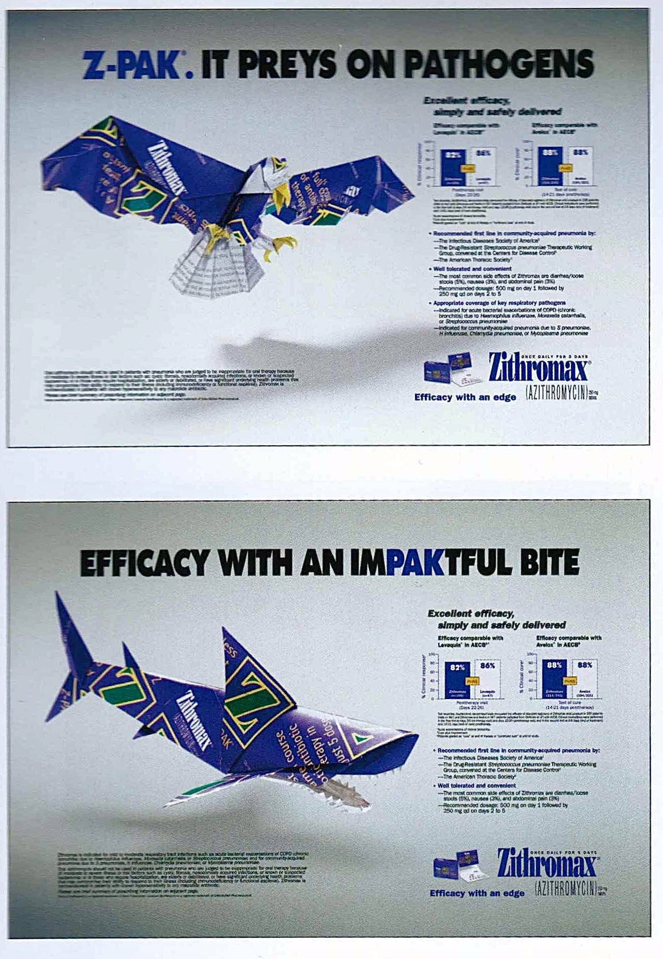 The brand that did it first and probably the best using paper sculptures, was ZITHROMAX (azithromycin) promoting the Z-Pak in 2002. Not only did it emphasize its excellent efficacy using animal predators, but created them using the purple Z-Pak packaging. The Z-Pak was a unique marriage of dosing regimen and marketing. Even today, patients still request Z-Paks from their physicians. Hopefully no fingers were harmed or cut creating these ads.
 It’s a constant battle of creative wits to be original, not only when you’re competing internally with other creative teams for the big idea, but competing with creative healthcare history….just be careful you’re not repeating it.

 urge and make these metaphors extinct.


Recent Comments