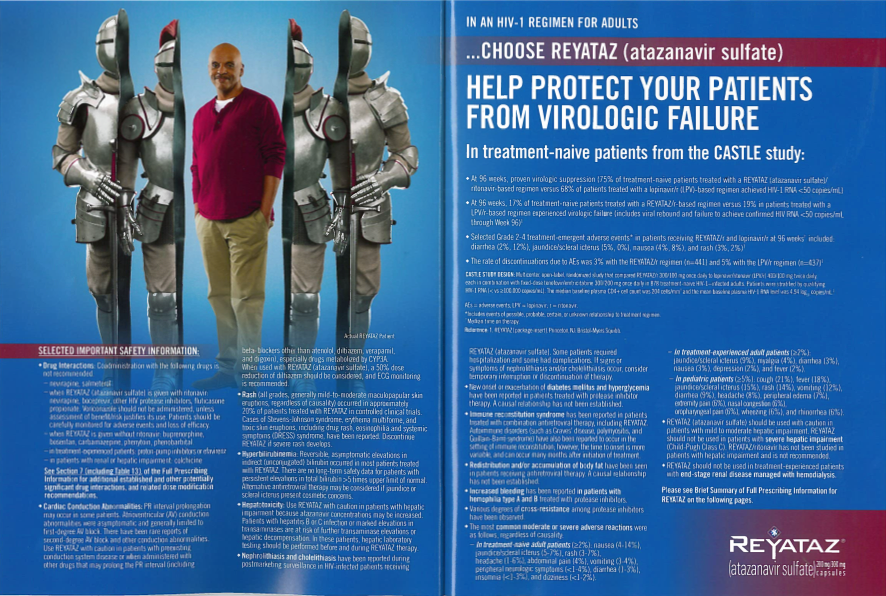
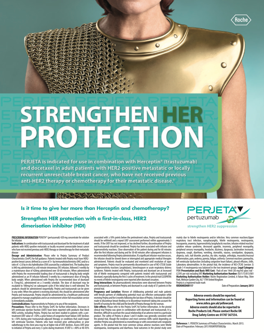
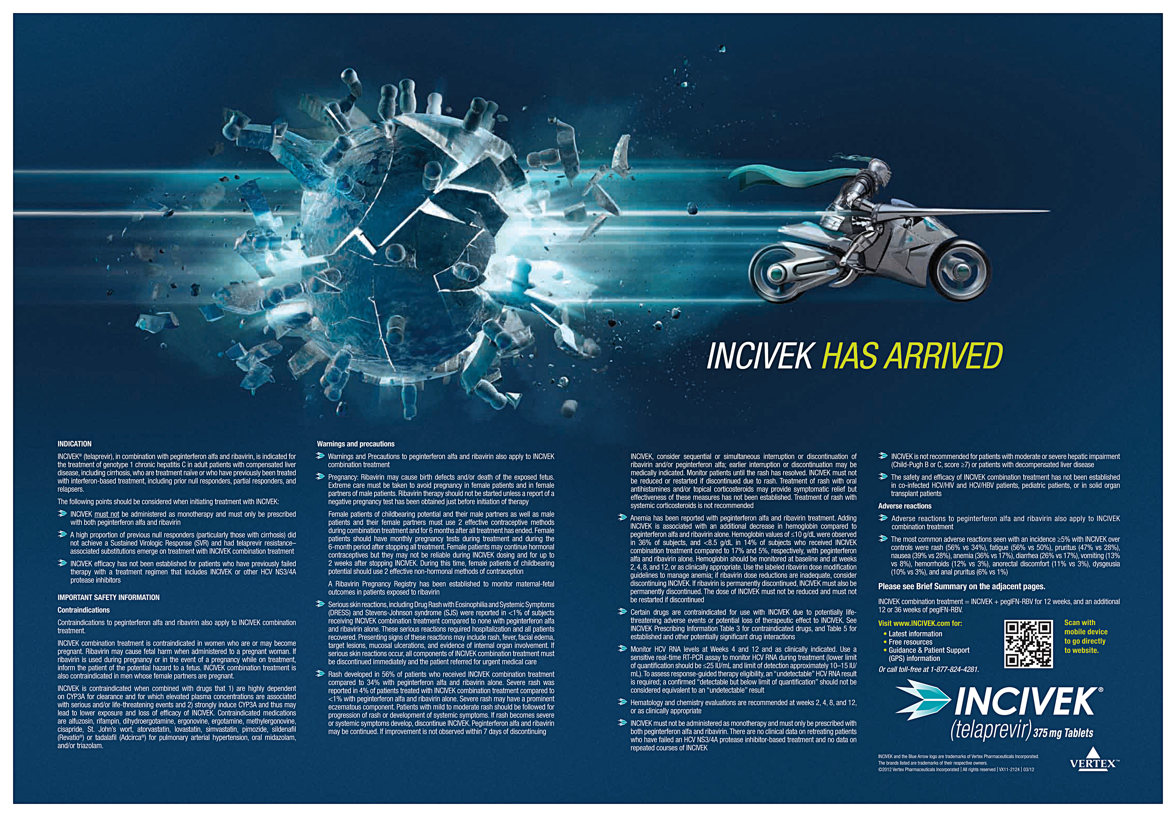
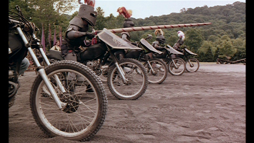
In the world of healthcare advertising, if you can think it, it’s probably already been done. Make sure to do your homework because even the most uncommon ideas, like say…origami animals, have been unfolding in pharma for years, becoming yet another cliché.
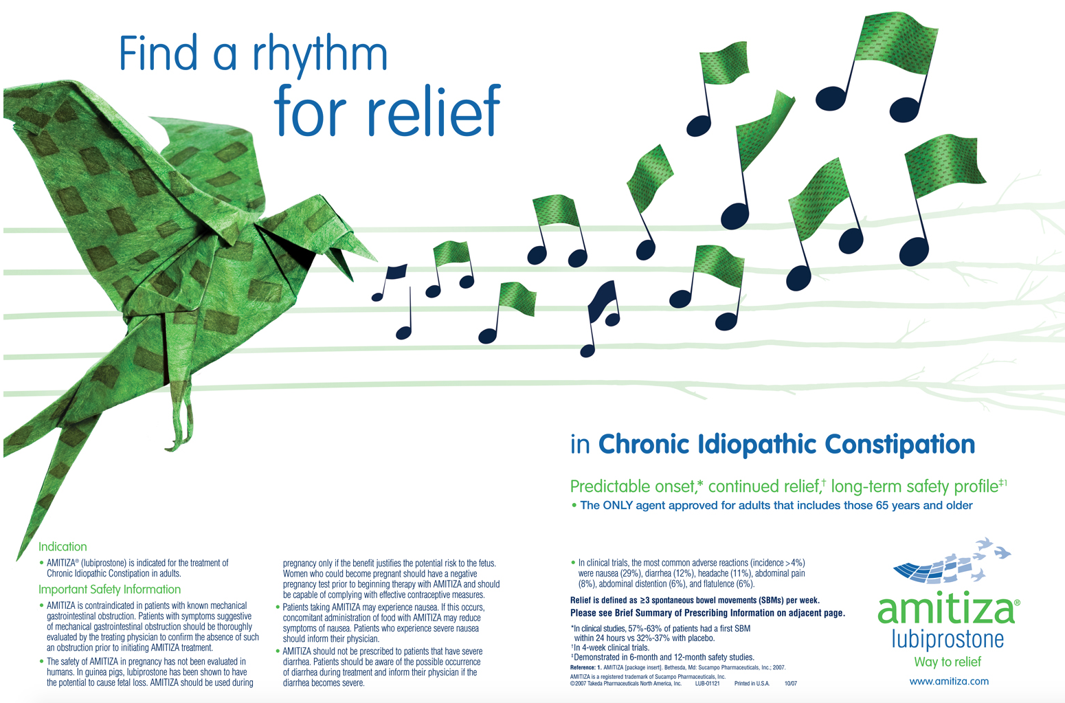
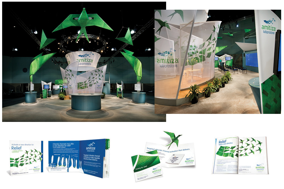 AMITIZA (lubiprostone) is a treatment for chronic idiopathic constipation. It increases fluid secretion in the intestines, which increases intestinal movement, which helps make it easier to have bowel movements. This MOA seems to be represented in their logo, a tight blockade of rectangles that start to dissipate and turn into flying birds. If there is one brand in pharma that has the rational excuse to use origami in their marketing, it would probably be AMITIZA. Those rectangles become paper transforming into origami birds, which is exactly what we find in a 2007 ad. Here, the AMITIZA bird is made of green branded paper singing branded paper musical notes. In the AMITIZA convention booth, the origami icon comes to life above its audience.
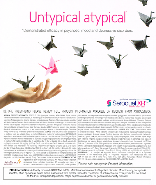 This 2012 ad for SEROQUEL (quetiapine) from Australia bears a strong resemblance to the AMITIZA birds, this time with flying origami crane. Yes five years have passed, yes it’s on a continent on the other side of the world, yes it’s in a different therapeutic category, but why would you still use an icon that is strongly tied to another global pharmaceutical brand? Maybe they should have created origami jailbirds because it’s a crime!
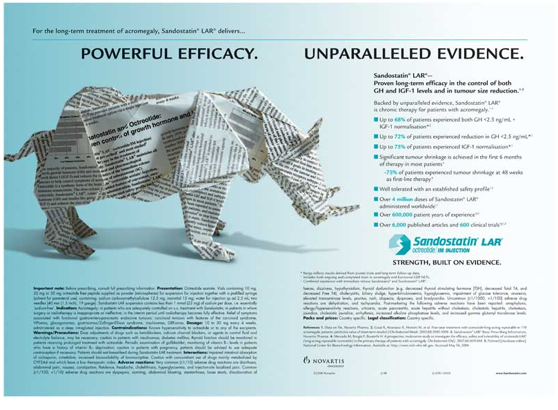 A 2010 ad for SANDOSTATIN (octreotide) and a Portuguese ad for PEGASYS (peginterferon alfa-2a) are almost identical. Both use printed clinical data to create their origami animals, a rhino for SANDOSTATIN and the iconic Pegasus for PEGASYS. The PEGASYS headline reads “Clinical studies and a lot of research transformed into life.”
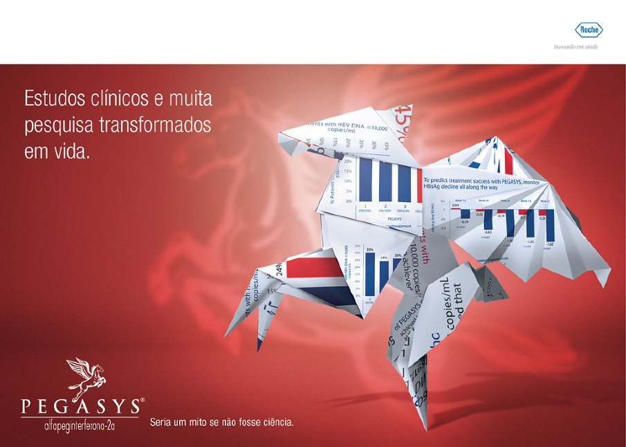 The big question is, which one would win in a fight, the rhino or the mythical Pegasus?
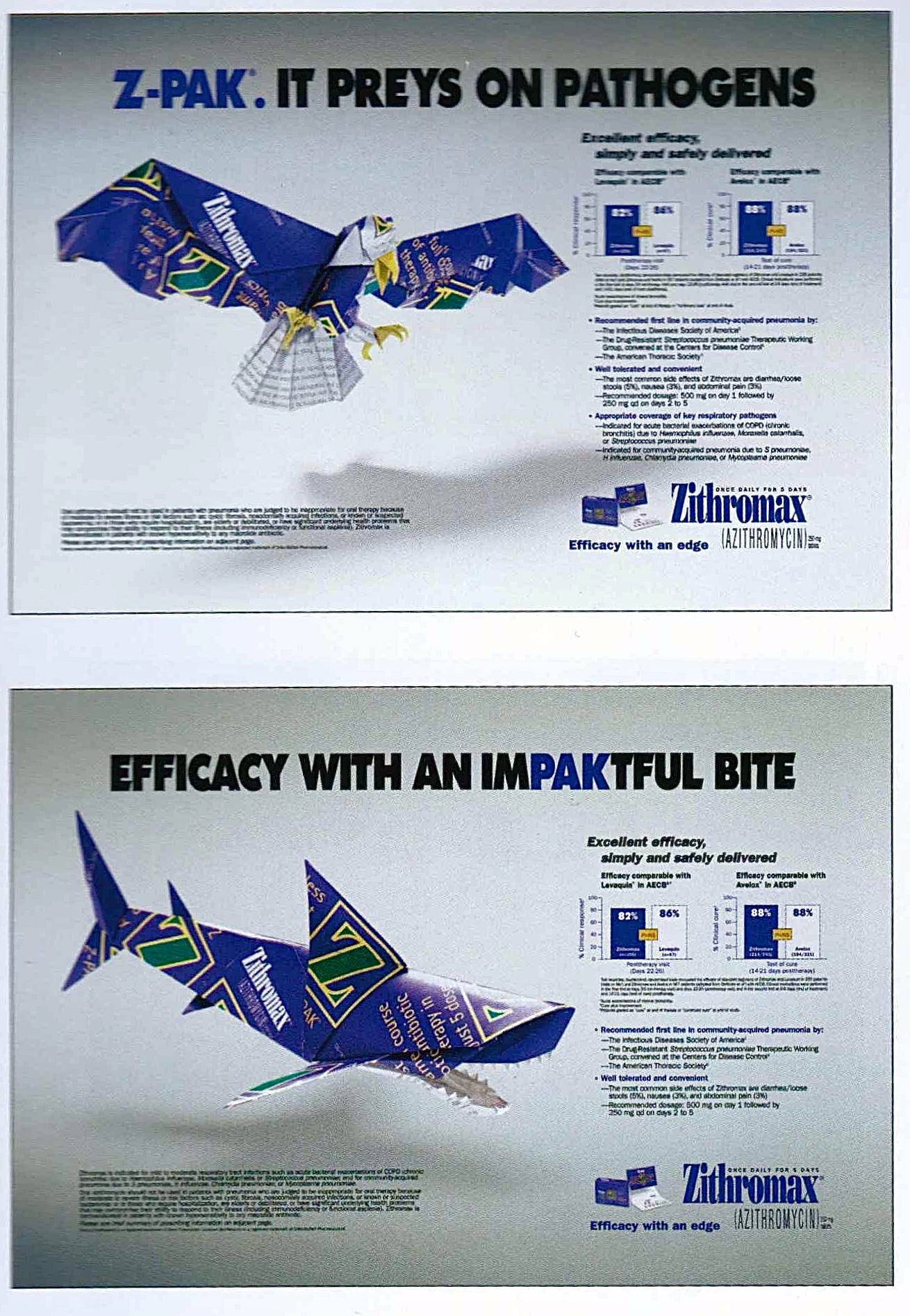 The brand that did it first and probably the best using paper sculptures, was ZITHROMAX (azithromycin) promoting the Z-Pak in 2002. Not only did it emphasize its excellent efficacy using animal predators, but created them using the purple Z-Pak packaging. The Z-Pak was a unique marriage of dosing regimen and marketing. Even today, patients still request Z-Paks from their physicians. Hopefully no fingers were harmed or cut creating these ads.
 It’s a constant battle of creative wits to be original, not only when you’re competing internally with other creative teams for the big idea, but competing with creative healthcare history….just be careful you’re not repeating it.
Recent Comments