The most used metaphors in the history of pharmaceutical advertising come from the animal kingdom, and probably none more so than the members of the genus Panthera: the tiger and the lion.
What’s not to love about these feline icons? They’ve been featured prominently in ancient mythology and folklore for thousands of years. They appear globally on many flags, coats of arms and as mascots of sports teams (especially if you live in Detroit). They are majestic animals and powerful, fierce hunters. You can find “a tiger in your tank” (Exxon), in your bowl of cereal (Frosted Flakes) or roaming the sales materials of representatives in doctors’ offices. Here are just five examples.
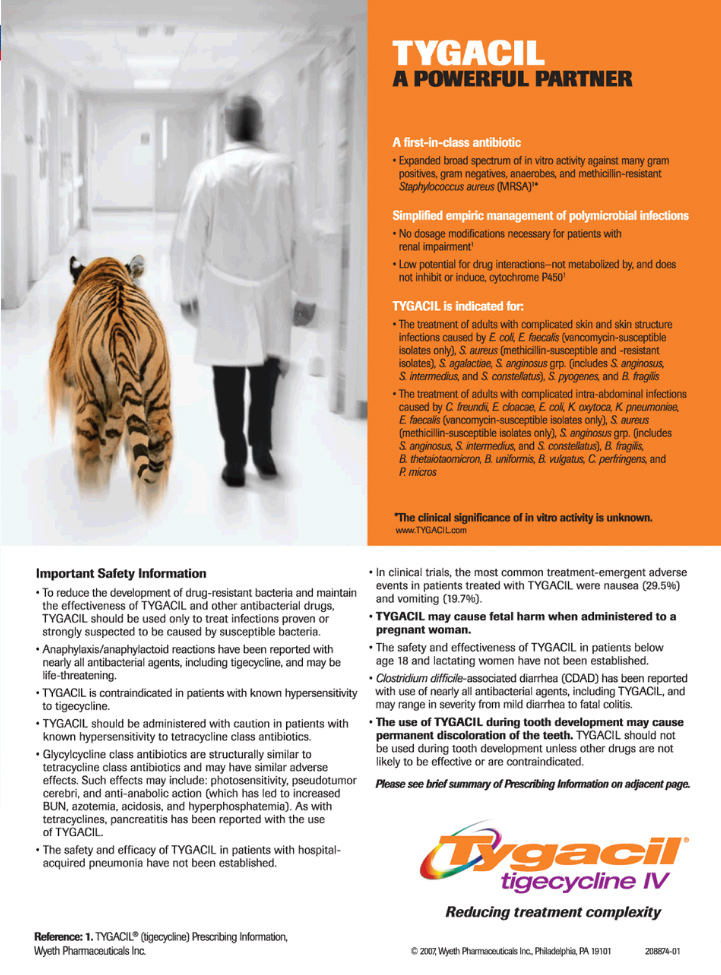 TYGACIL (tigecycline), a broad-spectrum hospital anti-infective from Wyeth, was approved in 2005. The launch ad depicts TYGACIL as a tiger, “A POWERFUL NEW PARTNER”, walking alongside a doctor through a hospital corridor. Obviously the doctor now has a manageable, yet fierce, antibiotic to fight resistant pathogens. While I don’t condone the use of endangered species in pharma ads, I could see the lure of reinforcing TYGACIL’s name recognition with a tiger at launch.
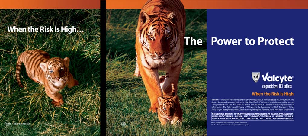 VALCYTE (valganciclovir) is prescribed for the prevention of cytomegalovirus (CMV) disease in high-risk adult and pediatric transplant patients. In this multi-page ad, one of the indicated pediatric patients is depicted as a tiger cub, helpless and possibly within the sights of a predator. “WHEN THE RISK IS HIGH”, you need “THE POWER TO PROTECT”. We get it, VALCYTE is now the tiger because there is no fiercer animal than a tiger or lion momma protecting her young…’nuff said! But it’s still just a stock shot of tigers as I’m waiting for Marlin Perkins (google him, kiddies) or Jeff Corwin to narrate this documentary.
In the pharma world, 2009 must have been the Year of the Lion because we were introduced to two lion campaigns (not be confused with Cannes Lions).
Allergan’s COMBIGAN (brimonidine/timolol) treats pressure in the eye caused by glaucoma. The brand is depicted in their ad as a lion comfortably sitting on a couch (probably watching Born Free…google that too, kids!) next to a patient reading the Global Times. “POWER YOU CAN BE COMFORTABLE WITH”, until you get mauled to death in the comfort of your own living room or by a tiger in the hospital cafeteria.
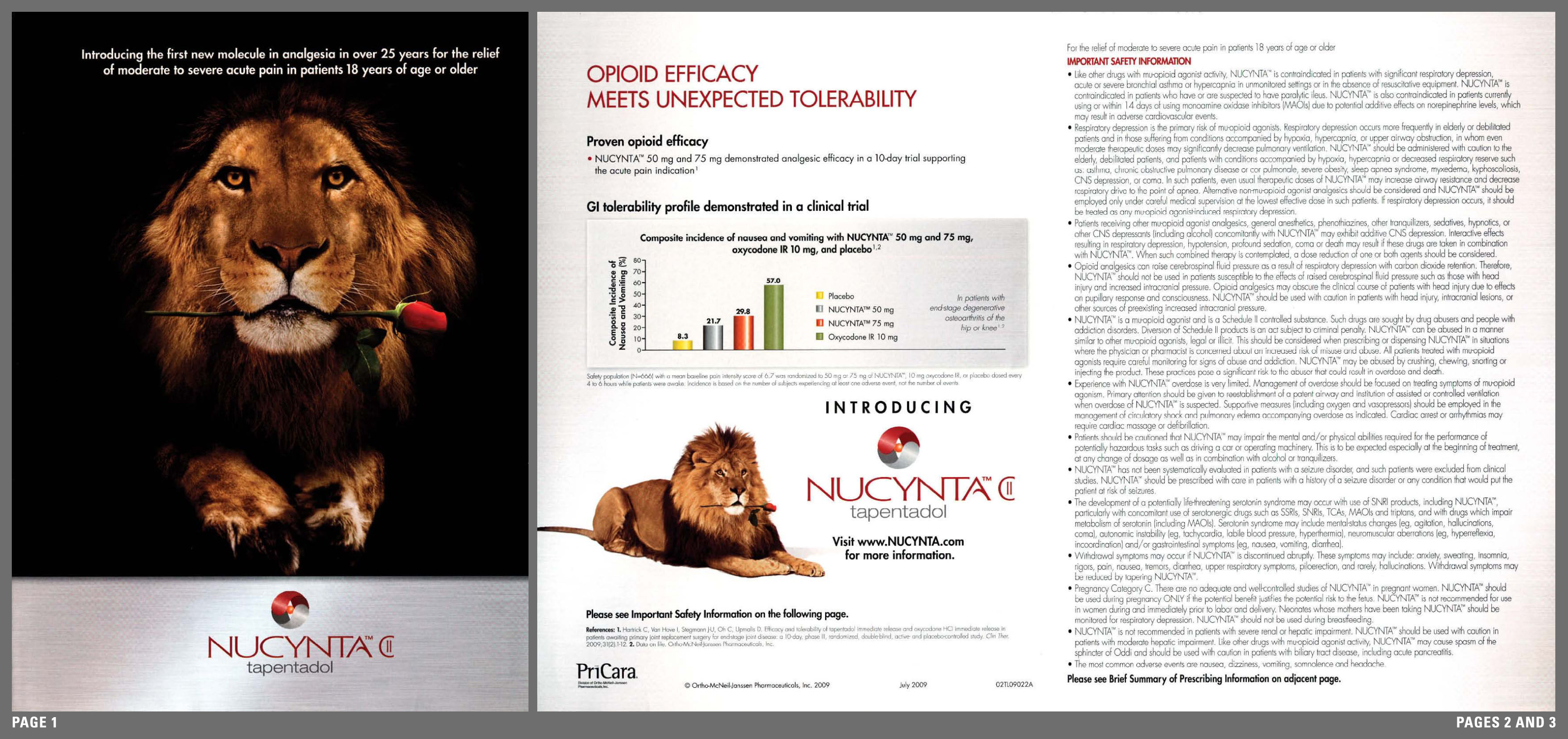 The creative brief for painkiller NUCYNTA (tapentadol) probably had two words leaping off the page for the creative teams: gentle strength. That would explain why we see a Casanova King of the Jungle with a rose in his mouth ready to lure you into a lascivious tango or to be his dinner.
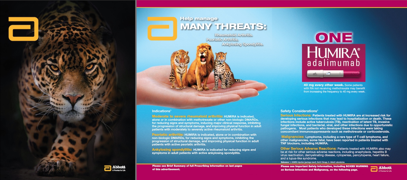
Abbott, makers of HUMIRA (adalimumab) turned the tables in 2012 and made these animals a vicious threat as we see a leopard coming out of the darkness eyeing us like a gazelle with gout. No headlines are necessary here because in healthcare advertising no one can hear you scream (unless you see an ad using red boxing gloves, but that’s a topic for another article). Turn the page and you can hear HUMIRA shouting, “Honey, I Shrunk the Cats!” as a tiger, a lion and the leopard now conveniently fit in your palm but still large enough to gnaw the fingers from your hand.
Those were just a few examples, but there are many more. We haven’t had any lion sightings in a while, but those big cats are lurking out there, waiting to be used as an icon for your next client. Fight the urge and make these metaphors extinct.

Recent Comments